We still put our customers first. We still quickly adapt to any size project. We still pride ourselves on being the best commercial general contracting team in the greater Phoenix area.
But we’ve also evolved, as we continue to be an innovative leader in the ever-changing landscape of commercial construction. With a dynasty of experience, we set our sights on the future.
This year, we have a new, strong, distinctive identity to better reflect our brand — who we are and the quality of work we do — clarifying communications and elevating our presence in the marketplace.
We’re the same RBI, only better.

About our logo
The new RBI logo visually represents our brand — the sum total of everything the world sees and hears about us, how we conduct ourselves in business, our commitment to customer service, and the consistently high quality of commercial construction projects we produce.
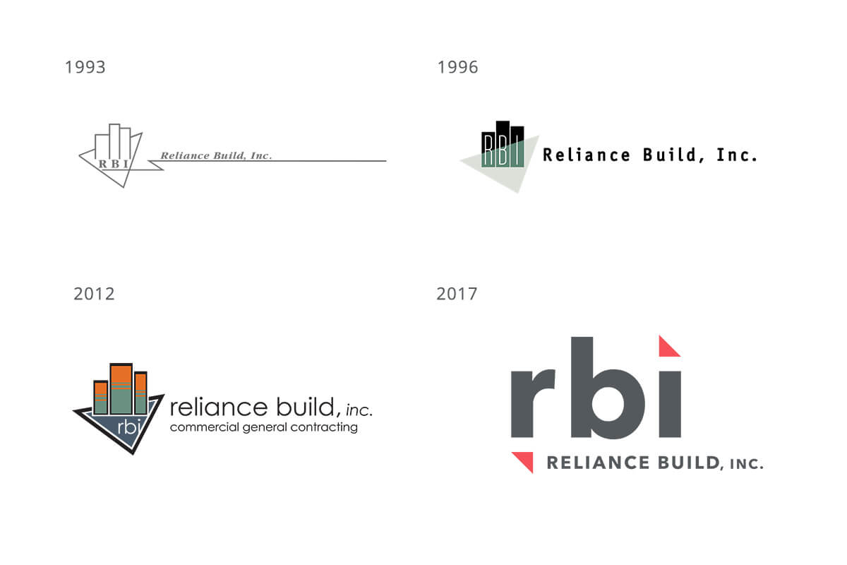
Rooted in the design elements of original RBI logos by leveraging the triangles — the “tittle” on the “i” is a triangle with a corresponding triangle in the lower-left, pointing to the center — the new logo centers on a striking, simple wordmark, set in lowercase to soften the sleek, minimal graphics in the rest of the identity. Bold red accents add impact to sophistication.
Red represents strength, passion, competence, dynamism, energy.
Triangles represent strength, stability, dynamism, three members of family-owned leadership team.


